Dashboard for COVID-19 statistics in the United Kingdom
At the time of writing, the COVID-19 pandemic is keeping the world in its grip. Loads of numbers and statistics are popping up on the Internet, and with these numbers changing increasingly fast, it is hard to keep up to date on the most recent official statistics. Therefore, I decided to make this a bit easier and develop a Shiny dashboard to display the latest accurate numbers for the United Kingdom (UK) from official data from Public Health England (PHE).1
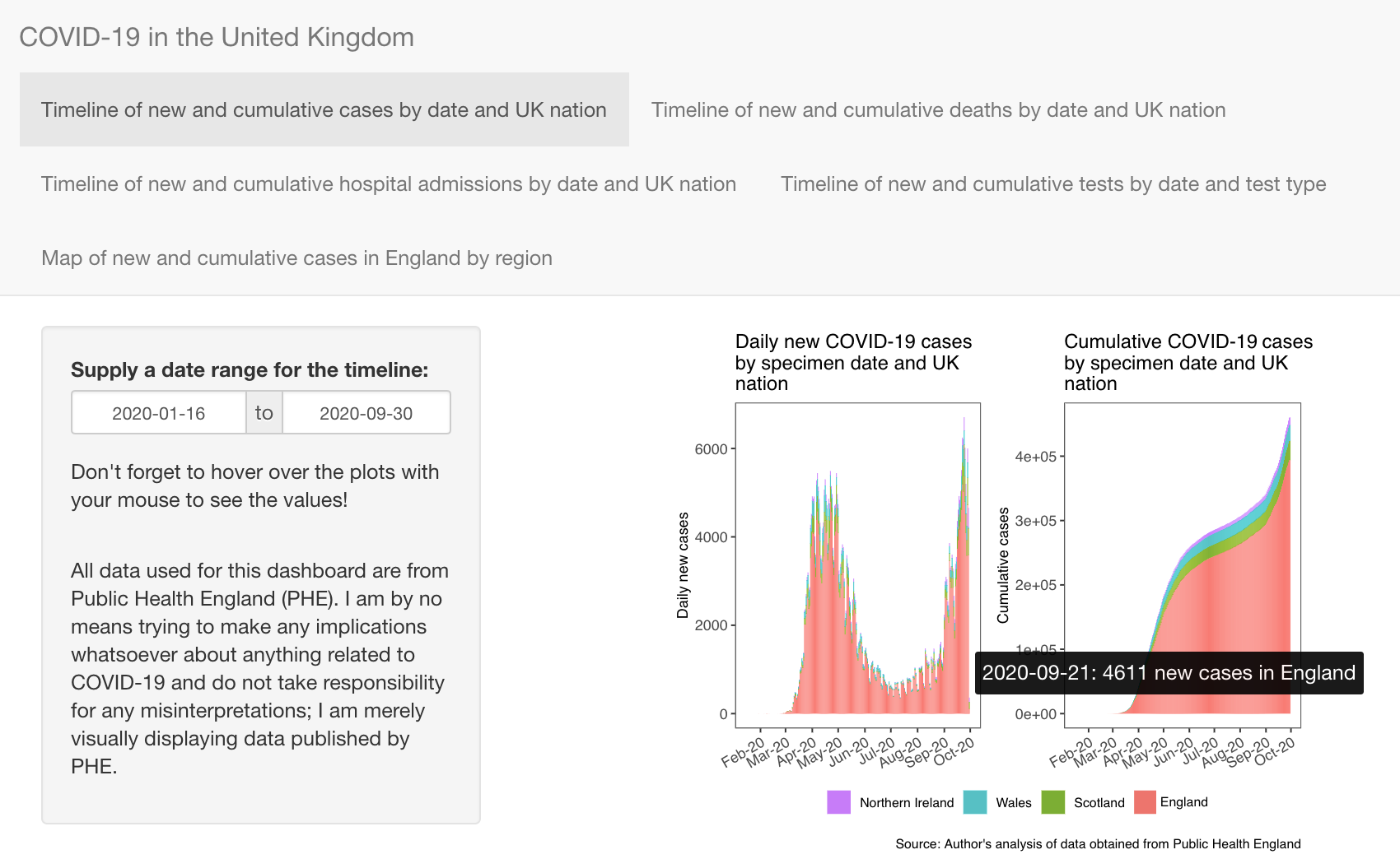
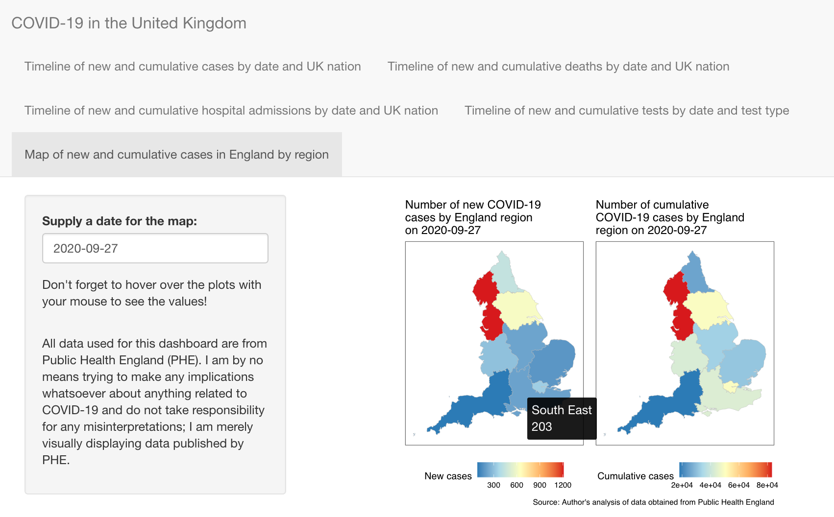
The dashboard contains several different plots. The first three show timelines of new daily and cumulative cases, deaths and hospital admissions, respectively. The fourth shows the daily new and cumulative number of tests by date and test type. The final tab shows the total number of cases across England by region. See the two screen shots below to have an idea of what the dashboard looks like. This file on my Github page contains the code to create this dashboard.


1 I am by no means trying to make any implications whatsoever about anything related to COVID-19 and do not take responsibility for any misinterpretations; I am merely visually displaying data published by PHE.
